CLIENT: GRAYBUG VISION
Vibrant Vision
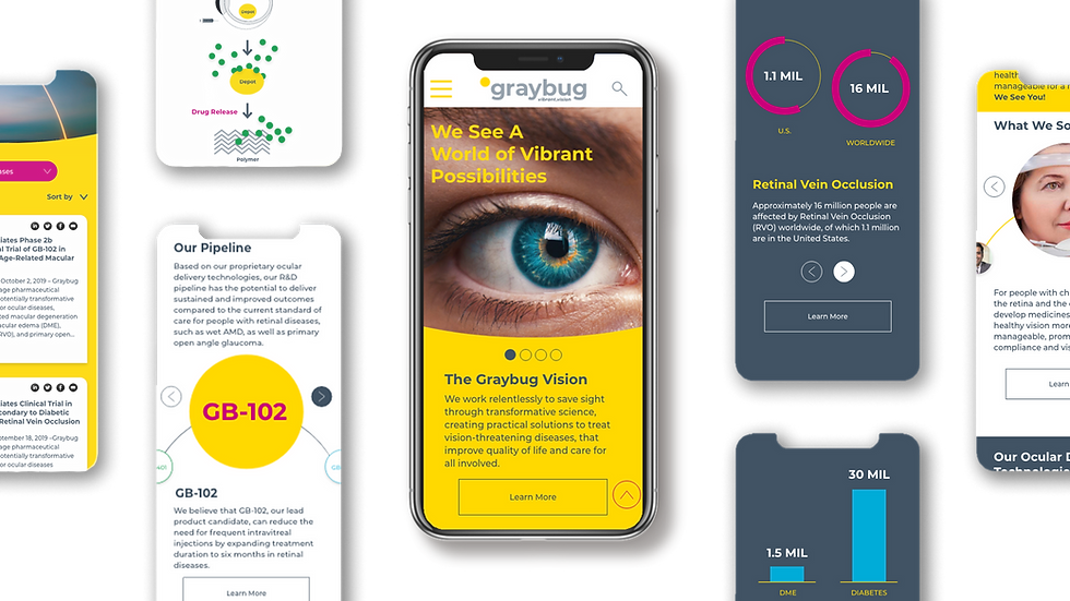
Copeland build a modern, bold identity system for a cutting edge Silicon Valley biotech firm with an unusual name—Graybug Vision. Our brand theme, Vibrant Vision, reflected the idea that Graybug is saving sight through transformative science, improving the quality of life and care for all involved.
STRATEGY | POSITIONING | IDENTITY | VIS | WEB


The Challenge
Create a flexible, highly legible design system that reflects the transformative science behind the treatment of chronic diseases of the retina and optic nerve. Making the complex simple…always a challenge…as the new brand launch was timed with the launch of their IPO.


Action
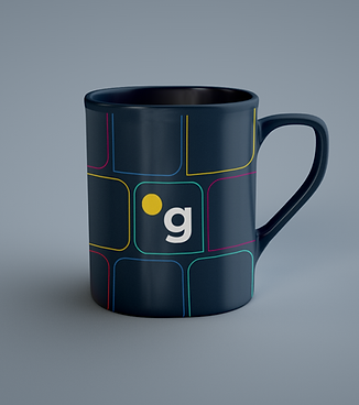
Graybug’s expansive design system included a vibrant palette of primary colors, bold patterns, proprietary iconography and a consistent illustration style. All of the design elements support an array of applications for the website, corporate presentations and medical research posters.


Result
The new Graybug brand identity confidently reflects their belief that the world should be a place of brilliance, clarity, light and hope. With bright yellow creating a bold proprietary backdrop for all brand communication, they stood out within their industry as they successfully launched their IPO.


